Gallery websites are like first dates. So many are poorly designed. So many think that cool colors equal "artiness" but no...go for black and white (or gray) - it always looks crisp and current. Keep it simple, clean and confident. I don't need to read a novel before I get to know you either. I want to judge you first by your personality. No clutter. Just be a gallery. Now for you show-offs, if you are going to use flash then make it be navigable and quick. Don't have me waiting around while a big design or logo opens up (I hate those time count down clocks). Sorry but I will already be gone and off to the next site. And if you have an opening coming it might be wise to advertise that on the first page, but again less is more. Don't show me every piece that will be in the show ahead of time. If I miss out and it is after the opening then you can show me images - I like to know what I missed but just don't ruin the surprise if I am coming. For the opening have one picture of the new work and then three links: press release, artist cv/bio, and old work link. There you go. Now I am interested and enjoying my meal. For the rest of the nuts and bolts follow similar suit. Now sometimes I like when there is a tiny image by the artist name representing the work but this can make for a sloppy artist page. You decide if you can make it work. If not, then make the artists' works viewable in a way that doesn't involve a lot of back and forth clicking. Maybe a gallery view page or images can open in new window. If I have gotten here then you have my attention so I might give a little to get a little.
Here are some sites I like:
sister la -best in show
winkleman -lots of info but organized
metro pictures - yeah, it is a big site, but fast moving (and flash) and easy to navigate.
honor fraser - just clean
on stellar rays - like the personality just give me the artists page
blum and poe -simple logo start page
Here are some sites that drive me bonkers:
deitch -ok, the sound is fun but not if you are at work or trying to look in private!
reena spaulings -this is an example of a love/hate. I was specifically trying to find an image by an artist but it wasn't on the site. But the funny "mooning" pic made me laugh...so I guess I can be bought by originality and humor?
forever and today - need more info
bespoke gallery -your flash has me waiting
cirrus gallery -goodness you are ugly
***
And here's an example of a show in NY. I am not in NY but I like to "virtually" attend shows. This one caught my attention. Interesting title but the website had almost no info about the artist work in the show. No artist list present so I had to look up the artists' works to see what the show was all about. I do this often when group shows don't necessarily represent all the group artists. Annoying sometimes but other times worth it. You decide. Lately I have also been into the "little-brother-galleries". It takes more patience but is a great way of finding some under-the-radar artists and your diamond-in-the-rough.

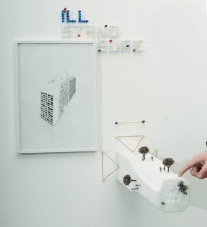
cayetano ferrer
clare churchouse
pier stockholm
david schafer
and others
FREE DIMENSIONALITY @ silver shed gallery NY


No comments:
Post a Comment