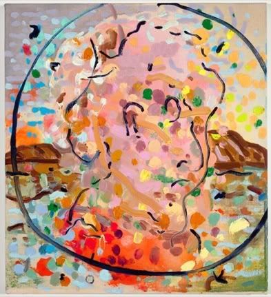

A little bit of the old...


and a little bit of experimentation...


leads to some new developments.
Knowing Schutz's works up close (usually containing a splattering of thick, bright globes of paint) I can't even begin to judge the successfulness of the recent batch, and will leave it up to Roberta. PS: someone tell Zach Feuer that less is more.
Dana Schutz: Missing Pictures
Zach Feuer Gallery, through April 25
Roberta Smith:
"Dana Schutz’s new paintings look a tad better on the gallery’s Web site than in person. Compression helps, which suggests the larger, more complicated canvases might be better at two-thirds size and that the bright colors could be intensified. Or maybe their complexity of palette and composition is not mutually enhancing; these canvases need to get away from one another. Still, Ms. Schutz deserves credit for not repeating herself. She continues her ambitious exploration of color, technique and history, both political and painterly..."
pics: zach feuer


3 comments:
in person they kinda suck...
she had gotten kinda boring, but i'm interested now. thanks for the tip.
tour of the show
http://www.youtube.com/watch?v=F59L4OJfRQ4
those holes in the guitar image are real holes. things are much more completed here despite the theme.
Post a Comment