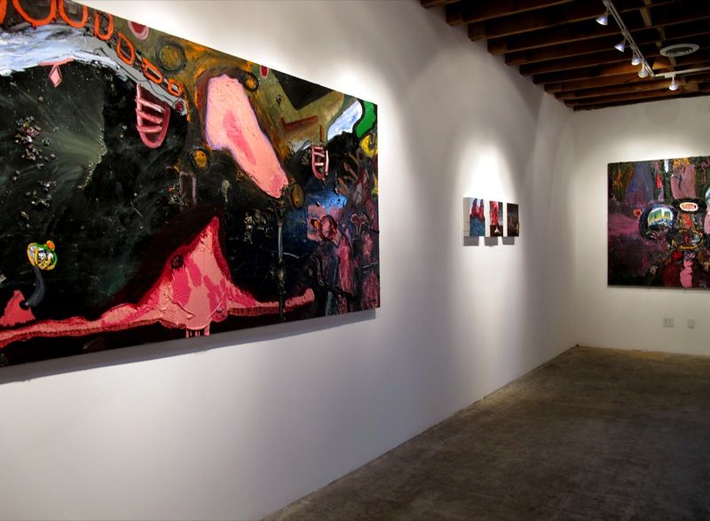
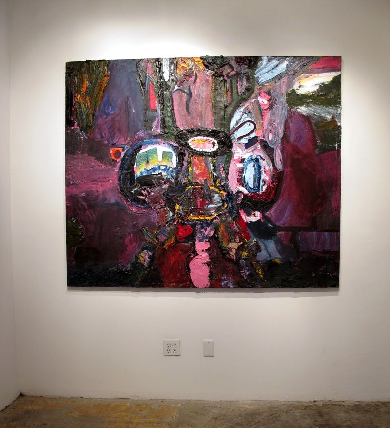
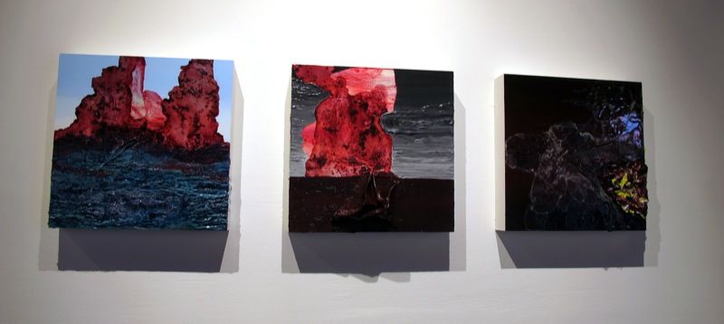
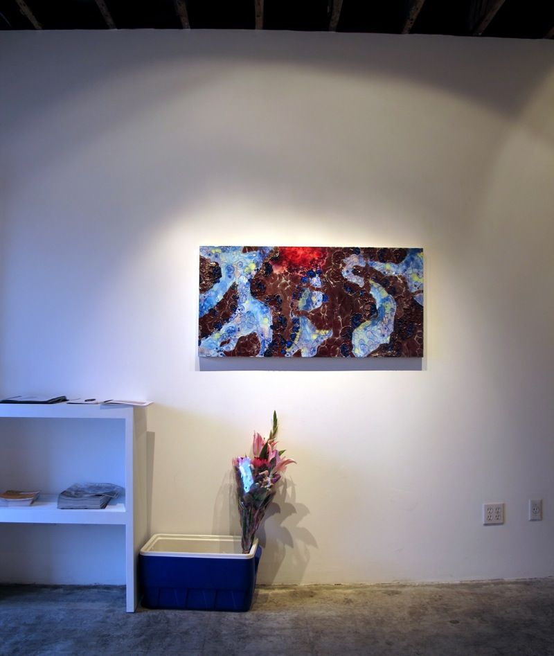
Ian Pines, Christina Pierson and Farnaz Nylander: Treasure Lost July 10, 2010 - August 21, 2010 JK Gallery
2 comments:
M
said...
You'd think more of those into the arts would know better than to use Arial. I see it used quite a bit in exhibition materials (even for wall titles announcing artists!). Here we are appreciating things, but then there's the Arial, like a small turd on a gallery floor. So many great typefaces out there - works of art themselves, worthy of appreciation as well - that could be used. I know, I nitpick. But as much as a lover of art that I am, I am just as much a lover of good design. Love this fucking blog, by the way.


2 comments:
You'd think more of those into the arts would know better than to use Arial. I see it used quite a bit in exhibition materials (even for wall titles announcing artists!). Here we are appreciating things, but then there's the Arial, like a small turd on a gallery floor. So many great typefaces out there - works of art themselves, worthy of appreciation as well - that could be used. I know, I nitpick. But as much as a lover of art that I am, I am just as much a lover of good design. Love this fucking blog, by the way.
M, I'm with you all the way. Bubblegum and wingdings are way more creative. I use Jester font for my work.
Post a Comment